
 100% FREE ACCESS
12th Standard Syllabus & Materials
12th Standard
TN 12th Maths Applications of Matrices and Determinants Sample Question Papers Study Material - QB365 Set A
NEW12th Standard
TN 12th Computer Applications மின்னணு தரவு பரிமாற்றம் Sample Question Papers Study Material - QB365 Set A
NEW12th Standard
TN 12th Computer Applications மின் - வணிக பாதுகாப்பு அமைப்புகள் Sample Question Papers Study Material - QB365 Set A
NEW12th Standard
TN 12th Computer Applications மின்னணு செலுத்தல் முறைகள் Sample Question Papers Study Material - QB365 Set A
NEW12th Standard
TN 12th Computer Applications மின் - வணிகம் Sample Question Papers Study Material - QB365 Set A
NEW12th Standard
TN 12th Computer Applications திறந்த மூல கருத்துருக்கள் Sample Question Papers Study Material - QB365 Set A

Published on: 13/09/2022
QB365 provides a detailed and simple solution for every Possible Creative Questions in Class 12 Computer Science Subject - Data Visualization Using Pyplot: Line Chart, Pie Chart and Bar Chart , English Medium. It will help Students to get more practice questions, Students can Practice these question papers in addition to score best marks.
Download Tamil Nadu 12th Standard Computer Science question papers, model tests, one-mark questions, important questions, and public exam papers in PDF format. Free study materials and answer keys for TN State Board students.
Questions + Answers key
Take MCQ Computer Science Test
1.
Explain in detail about pie chart with a example coding.
2.
Write the key difference between Histogram and BarGraph.
3.
What is bar chart? Explain with an example coding.
4.
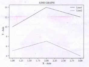
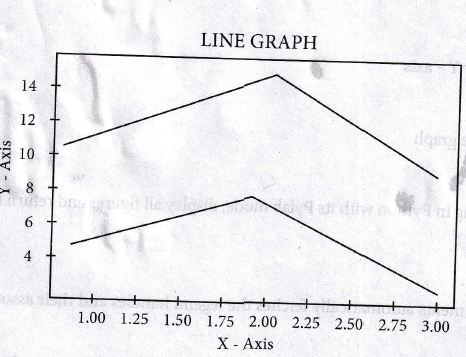
How will you plot two lines? Give an example with output.
5.
Write s python code to display to following plot.
Program
6.
Write the key differences between Histogram and bar graph.
7.
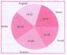
Write a python code to display the following, plot.
1.
Pie chart:
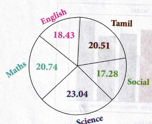
Pie Chart is Probably one of the most common type of chart. It is a circular graphic which is divided into slices to illustrate numerical proportion. The Point of a pie chart is to show the relationship of parts out of a whole.
To make a Pie Chart with Matplotlib, we can use the plt.pie() function. The autopct parameter allows us to display the percentage value using the Python string formatting.
Example:
import matplotlib.pyplot as plt
sizes = [89, 80, 90, 100, 75]
labels = ["Tamil", "English", "Maths", "Science", "Social"]
plt.pie (sizes, labels = labels, autopct = "%.2f")
plt.axes( ).set_aspect ("equal")
pIt.show ( )
Output:
2.
1. Histogram refers to a frequency of graphical representation; that displays data numerical by way of bars to show the data. A bar graph is a pictorial representation of data that uses bars to compare different categories of data.
2. A histogram represents the frequency distribution of continuous variables. Conversely, a bar graph is a diagrammatic comparison of discrete variables.
3. Histogram presents numerical data whereas bar graph shows categorical data.
4. The histogram is drawn in such a way that there is no gap between the bars. On the other hand, there is proper spacing between bars in a bar graph that indicates discontinuity.
5. Items of the histogram are numbers, which a categorize together, to represent ranges of data. As opposed to the bar graph, items are considered as individual entities.
6. In the case of a graph, it is quite common to rearrange the blocks, from highest to lowest. But with histogram, this cannot be done, as they are shown in the sequence of classes.
3.
Bar Chart:
A Bar plot is one of the most common type of plot. It shows the relationship between a numerical variable and a categorical variable.
Bar chart represents categorical data with rectangler bars. Each bar has a height corresponds to the value it represents. The bars can be plotted vertically. It's useful when we want to compare a given numeric value on different categories. To make a bar chart with matplotlib, we can use the plt.bar ( ) function.
import matplotlib.pyplot as plt
# Our data
labels = ["TAMIL", "ENGLISH", "MATHS", "PHYSICS", "CHEMISTRY", "CS"]
usage = [79.8, 67.3, 77.8, 68.4, 70.2, 88.5]
# Generating the y positions.
y_positions = range (len(labels))
# Creating our bar plot
plt.bar (Y_positions, usage)
plt.xticks (Y_positions, labels)
plt.ylabel ("RANGE")
plt.title ("MARKS")
plt.show( )
Ouptut:
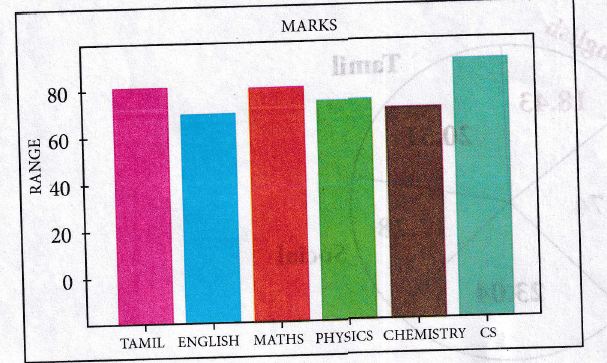
Labels → specifies labels for the bars.
Usage → Assign values to the labels specified.
Xticks → Display the tick marks along the X-axis at the values represented. Then specify the label for each tick mark.
Range → Create sequence of numbers.
4.
Program:
To plot two lines, use the following code:
import matplotlib.pyplot as plt
x = [1, 2, 3]
Y = [5, 7, 4]
x2 = [1, 2, 3]
y2 = [10, 14, 12]
plt.plot(x, y, Iabel = 'Line 1')
plt.plot(x2, y2, Iabel = 'Line 2')
pIt.xlabel('X - Axis')
pIt.yIabel('Y - Axis')
pIt.title('LINE GRAPH')
plt.legend ( )
plt.show ( )
Output:
With plt.xlabel and plt.ylabel, we can assign labels to that respective axis, Next, we can assign the plot's title with plt.title, and then we can invoke the default legend with plt.legend( ).
5.
Program:
import matplotlib.pyplot as plt
x = [1,2,3]
Y = [5,7,4]
x2 = [1,2,3]
y2 = [10,14,12]
plt.plot(x, y, Iabel='Line 1')
plt.plot(x2, y2, Iabel='Line 2')
pIt.xlabel('X -Axis')
pIt.yIabel('Y- Axis')
pIt.title('LINE GRAPH')
plt.legend ( )
plt.show ( )
6.
| S.No | Histogram | Bar graph |
| i) | Histogram refers to a graphical representation; that displays data by way of bars to show the frequency of numerical data. | A bar graph is a pictorial representation of data that uses bars to compare different categories of data. |
| ii) | A histogram represents the frequency distribution of continuous variables. | Conversely, a bar graph is a diagrammatic comparison of discrete variables. |
| iii) | Histogram presents numerical data | Bar graph shows categorical data |
| iv) | Items of the histogram are numbers, which are categorised together, to represent ranges of data. | As opposed to the bar graph, items are considered as individual entities. |
| v) | A histogram, this cannot be done, as they are shown in the sequence of classes. | In the case of a bar graph, it is quite common to rearrange the blocks, from highest to lowest. |
| vi) | The width of rectangular blocks in a histogram mayor may not be same | The width of the bars in a bar graph is always same. |
7.
Program:
import matplotlib.pyplot as plt
sizes = [89, 80, 90, 100, 75]
labels = ["Tamil", "English", "Maths", "Science", "Social"]
plt.pie (sizes, labels = labels, autopct = "%.2f")
plt.axes( ).set aspect ("equal")
pIt.show ( )

12th Standard Syllabus & Materials
12th Standard
TN 12th Computer Applications வலையமைப்பு வடமிடல் Sample Question Papers Study Material - QB365 Set A
NEW12th Standard
TN 12th Computer Applications களப்பெயர் முறைமை (DNS) Sample Question Papers Study Material - QB365 Set A
NEW12th Standard
TN 12th Computer Applications வலையமைப்பு எடுத்துக்காட்டுகள் மற்றும் நெறிமுறைகள் Sample Question Papers Study Material - QB365 Set A
NEW12th Standard
TN 12th Computer Applications கணினி வலையமைப்பு ஓர் அறிமுகம் Sample Question Papers Study Material - QB365 Set A



Tamilnadu Stateboard 12th Standard Subjects

Maths

Chemistry

Physics

Biology
Computer Science

Business Maths and Statistics
Economics

Commerce

Accountancy

History

Computer Applications
Biology
Computer Technology
Computer Applications
Computer Science
Business Maths and Statistics
Commerce
Economics
Maths
Chemistry
Physics
Computer Technology
History
Accountancy

Tamil

English

French
Tamilnadu Stateboard Standards
