
 100% FREE ACCESS
12th Standard Syllabus & Materials
12th Standard
TN 12th Computer Applications மின்னணு தரவு பரிமாற்றம் Sample Question Papers Study Material - QB365 Set A
NEW12th Standard
TN 12th Computer Applications மின் - வணிக பாதுகாப்பு அமைப்புகள் Sample Question Papers Study Material - QB365 Set A
NEW12th Standard
TN 12th Computer Applications மின்னணு செலுத்தல் முறைகள் Sample Question Papers Study Material - QB365 Set A
NEW12th Standard
TN 12th Computer Applications மின் - வணிகம் Sample Question Papers Study Material - QB365 Set A
NEW12th Standard
TN 12th Computer Applications திறந்த மூல கருத்துருக்கள் Sample Question Papers Study Material - QB365 Set A
NEW12th Standard
TN 12th Computer Applications வலையமைப்பு வடமிடல் Sample Question Papers Study Material - QB365 Set A

Published on: 03/02/2021
12th Standard Computer Science English Medium Data Visualization Using Pyplot Reduced Syllabus Important Questions 2021
Download Tamil Nadu 12th Standard Computer Science question papers, model tests, one-mark questions, important questions, and public exam papers in PDF format. Free study materials and answer keys for TN State Board students.
Questions + Answers key
Take MCQ Computer Science Test
1.
________ and ______ are the two ways to display data in the form of diagram.
Line chart, Pie chart
Line chart, Bar chart
Bar Graph, Histogram
Line chart, Histogram
2.
Zoom out will require ________ and drag.
click
left click
double click
right click
3.
If a list given to the plot ( ) command, matplotlib assumes it is a sequence of _____ values
X
Y
0
4
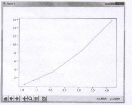
4.
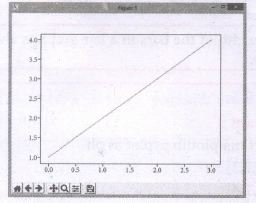
______ in data visualization helps to show relationship in the data for more variables
Tables
Graphics
Charts
Dashboards
5.
_______ is the graphical representation of information and data.
Data visualization
Data Graphics
Data Dimension
Data Images
6.
Data visualization used ________ graphics.
2D
3D
Statistical
Image
7.
Which parameter used to display ( ) the percentage value using Python string formatting in pie chart?
percent
autopct
pet
percentage
8.
Which plot is a circular graphical representation of numerical data?
Histogram
xy plot
Bar plot
Pie chart
9.
Which of the following one indicates discontinuity?
Histogram
Pie
Bar graph
None of these
10.
A line chart is type of chart which displays on formats as a data points called
series
markers
plot
lib
11.
Which button will help to navigate the chart?
Navigate
Pan
Home
Zoom
12.
Which of the following command will take an arbitrary number of arguments?
show ( )
plot ( )
legend ( )
title ( )
13.
The default x.vector has the same length of y but starts with
3
2
1
0
14.
Which of the following is not a five number summary in box plot visualization?
First Quartile
Second Quartile
Third Quartile
Minimum
15.
Which plot displays the distribution of data based on the five number summary?
Scatter plot
Line plot
Box plot
Chart plot
16.
Which of the following is a type of plot that shows the data as a collection of points?
Box plot
Chart plot
Line plot
Scatter plot
17.
Which of the following translate complex ideas and concepts into a simple visual format?
(i) Data visualization
(ii) Dashboards
(iii) Tables
(iv) Maps
i,iii
iii, i
i, iv
i, ii
18.
The numerical data is encoded using
dots
lines
bars
all of these
19.
Identify the right type of chart using the following hints.
Hint 1: This chart is often used to visualize a trend in data over intervals of time.
Hint 2: The line in this type of chart is often drawn chronologically.
Line chart
Bar chart
Pie chart
Scatter plot
20.
Read the following code: Identify the purpose of this code and choose the right option from the following.
C:\Users\Your Name\AppData\Local\Programs\Python\Python36-32\Scripts>pip list
List installed packages
list command
Install PIP
packages installed
21.
Read the following code: Identify the purpose of this code and choose the right option from the following.
C:\Users\YourName\AppData\Local\Programs\Python\Python36-32\Scripts>pip –version
Check if PIP is Installed
Install PIP
Download a Package
Check PIP version
22.
Identify the package manager for Python packages, or modules.
Matplotlib
PIP
plt.show()
python package
23.
What are the two ways to display data in the form of diagram?
24.
What is pip?
25.
Write note or Box plot.
26.
Define scatter plot.
27.
What is matplotlib?
28.
What is Dashboard?
29.
What is Infographics data visualization?
30.
Write the difference between the following functions: plt.plot([1,2,3,4]), plt.plot([1,2,3,4], [1,4,9,16]).
31.
32.
List the types of Visualizations in Matplotlib.
33.
List the general types of data visualization.
34.
What is Data Visualization?
35.
Read the following code. What does the following represents.
(i) Labels
(ii) Usage
(iii) X ticks
(iv) Range
(v) Show
36.
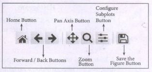
List the buttons in matlibplot window.
37.
Write a python code to display the following plot.
38.
Write a python code to display the following plot.
39.
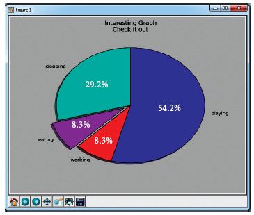
Write the plot for the following pie chart output.
40.
Write the coding for the following:
a. To check if PIP is Installed in your PC.
b. To Check the version of PIP installed in your PC.
c. To list the packages in matplotlib.
41.
Write any three uses of data visualization.
42.
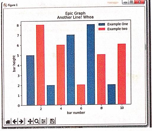
Draw the output for the following data visualization plot.
import matplotlib.pyplot as plt
plt.bar([1,3,5,7,9],[5,2,7,8,2], label="Example one")
plt.bar([2,4,6,8,10],[8,6,2,5,6], label="Example two", color='g')
plt.legend()
plt.xlabel('bar number')
plt.ylabel('bar height')
plt.title('Epic Graph in Another Line! Whoa')
plt.show()
43.
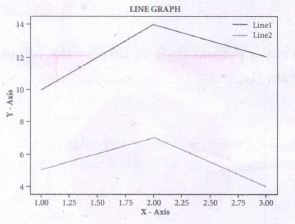
Write s python code to display to following plot.
Program
44.
Write the key differences between Histogram and bar graph.
45.
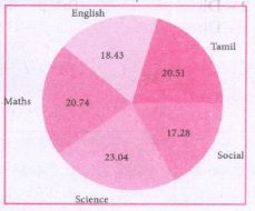
Write a python code to display the following, plot.
46.
Explain the purpose of the following functions:
a. plt.xlabel
b. plt.ylabel
c. plt.title
d. plt.legend()
e. plt.show()
47.
Explain the various buttons in a matplotlib window.
48.
Explain in detail the types of pyplots using Matplotlib.
1.
(c)
Bar Graph, Histogram
2.
(d)
right click
3.
(b)
Y
4.
(c)
Charts
5.
(a)
Data visualization
6.
(c)
Statistical
7.
(b)
autopct
8.
(d)
Pie chart
9.
(c)
Bar graph
10.
(b)
markers
11.
(c)
Home
12.
(b)
plot ( )
13.
(d)
0
14.
(b)
Second Quartile
15.
(c)
Box plot
16.
(d)
Scatter plot
17.
(d)
i, ii
18.
(d)
all of these
19.
(a)
Line chart
20.
(d)
packages installed
21.
(d)
Check PIP version
22.
(b)
PIP
23.
Bar Graph and Histogram are the two ways to display data in the form of a diagram.
24.
Matplotlib installed using pip. Pip is a management software for installing python packages.
25.
Box plot: The box plot is a standardized way of displaying the distribution of data based on the five number summary: minimum, first quartile, median, third quartile, and maximum.
26.
Scatter plot: A scatter plot is a type of plot that shows the data as a collection of points. The position of a point depends on its two dimensional value, where each value is a position on either the horizontal or vertical dimension.
27.
Matplotlib is the most popular data visualization library in Python. It allows to create charts in few lines of code.
28.
Dashboard → A dashboard is a collection of resources assembled to create a single unified visual display. Data visualizations and dashboards translate complex ideas and concepts into a simple visual format. Patterns and relationships that are undetectable in text are detectable at a glance using dashboard.
29.
Infographics → An infographic (information graphic) is the representation of information in a graphic format.
30.
| plt.plot ([I,2,3,4]) | plt.pIot ([I,2,3,4], [1,4,9,16]) |
|---|---|
| 1. It refers y values as [1,2, 3,4] | 1. It refers x and y values as ([1, 2, 3, 4], [1,4,9, 16]) |
| 2. Indirectly it refers x values as [0, 1, 2, 3] (0,1),(1,2), 2,3), (3,4) | 2. Directly given in the function (1,1), (2,4), (3,9), (4,16) |
31.
32.
(i) Line plot
(ii) Scatter plot
(iii) Histogram
(iv) Box plot
(v) Bar chart and
(vi) Pie chart
33.
(i) Charts
(ii) Tables
(iii) Graphs
(iv) Maps
(v) Infographics
(vi) Dashboards
34.
Data Visualization is the graphical representation of information and data. The objective of Data Visualization is to communicate information visually to users.
35.
(i) Labels ⇾ Specifies labels for the bars.
(ii) Usgae ⇾ Assign values to the labels specified.
(iii) Xticks ⇾ Display the tick marks along the x-axis at the values represented. Then specify the label for each tick mark.
(iv) Range ⇾ Create sequence of numbers.
(v) Show ⇾ Displays the plot
36.
37.
Program:
For example, to plot x versus y, you can issue the command:
import matplotlib. pyplot as plt
pIt.plot([1,2,3,4], [1,4,9,16])
plt.show ( )
Output:
38.
Program:
import matplotlib.pyplot as plt
pIt.plot([1, 2, 3, 4]) ,
plt.show ( )
Output:
39.
Plot:
import matplotlib.pyplot as plt
sizes = [105, 30, 30, 195]
label= ["sleeping", "eating", "working", "playing"]
plt.pie (sizes, labels = labels, autopct = "%.2f")
plt, axes ( ). set_aspect ("equal")
plt.show ( )
40.
(a) Check if PIP is Installed:
To check if PIP is already installed in our system, navigate our command line to the location of Python's script directory.
Command:
Python m pip install - U pip.
(b) To check PIP version:
To check the version of PIP in our system, type the command as:
C: \Users\Your Name\App Data\Local\Programs\Python\Python 36-32\Scripts> Pip--version.
(c) List packages:
To view the list of installed packages on our system, use the list command:
C:\Users\Your Name\App Data\Local\Programs\Python\Python 36-32\scripts> Pip list
41.
(i) Data Visualization help users to analyze and interpret the data easily.
(ii) It makes complex data understandable and usable.
(iii) Various Charts in Data Visualization helps to show relationship in the data for one or more variables.
42.
43.
Program:
import matplotlib.pyplot as plt
x = [1,2,3]
Y = [5,7,4]
x2 = [1,2,3]
y2 = [10,14,12]
plt.plot(x, y, Iabel='Line 1')
plt.plot(x2, y2, Iabel='Line 2')
pIt.xlabel('X -Axis')
pIt.yIabel('Y- Axis')
pIt.title('LINE GRAPH')
plt.legend ( )
plt.show ( )
44.
| S.No | Histogram | Bar graph |
| i) | Histogram refers to a graphical representation; that displays data by way of bars to show the frequency of numerical data. | A bar graph is a pictorial representation of data that uses bars to compare different categories of data. |
| ii) | A histogram represents the frequency distribution of continuous variables. | Conversely, a bar graph is a diagrammatic comparison of discrete variables. |
| iii) | Histogram presents numerical data | Bar graph shows categorical data |
| iv) | Items of the histogram are numbers, which are categorised together, to represent ranges of data. | As opposed to the bar graph, items are considered as individual entities. |
| v) | A histogram, this cannot be done, as they are shown in the sequence of classes. | In the case of a bar graph, it is quite common to rearrange the blocks, from highest to lowest. |
| vi) | The width of rectangular blocks in a histogram mayor may not be same | The width of the bars in a bar graph is always same. |
45.
Program:
import matplotlib.pyplot as plt
sizes = [89, 80, 90, 100, 75]
labels = ["Tamil", "English", "Maths", "Science", "Social"]
plt.pie (sizes, labels = labels, autopct = "%.2f")
plt.axes( ).set aspect ("equal")
pIt.show ( )
46.
(a) plt.xlabel:
plt.xlabel() \(\rightarrow \) specifies label for X - axis
(b) plt.ylabel:
plt.ylabel() \(\rightarrow \) specifies label for Y - axis
(c) plt.title:
plt.title() \(\rightarrow \) specifies title to the graph
(d) plt.show():
Display a figure. When running in Python with its Pylab mode, display all figures and return to the Python prompt.
(e) plt.legend():
Calling legend() with no arguments automatically fetches the legend handles and their associated labels.
47.
(i) Home Button \(\rightarrow \) The Home Button will help one to begun navigating the chart. If you ever want to return back to the original view, you can click on this.
(ii) Forward/Back buttons \(\rightarrow \) These buttons can be used like the Forward and Back buttons in browser. Click these to move back to the previous point you were at, or forward again.
(iii) Pan Axis \(\rightarrow \) This cross-looking button allows you to click it, and then click and drag graph around.
(iv) Zoom \(\rightarrow \) The Zoom button lets you click on it, then click and drag a square would like to zoom into specifically. Zooming in will require a left click and drag. Zoom out with a right click and drag.
(v) Configure Subplots\(\rightarrow \) This button allows you to configure various spacing options with figure and plot.
(vi) Save Figure \(\rightarrow \)This button will allow you to save figure in various forms
48.
Line Chart:
(i) A Line Chart or Line Graph is a type of chart which displays information as a series of data points called 'markers' connected by straight line segments.
(ii) A Line Chart is often used to visualize a trend in data over intervals of time - a time series - thus the line is often drawn chronologically.
Example:
import matplotlib.pyplot as plt
years = [2014, 2015, 2016, 2017, 2018]
total_populations = [8939007, 8954518, 8960387, 8956741, 8943721]
plt. plot ("years, total_populations)
pit. title ("Year vs Population in India")
plt.xlabel ("Year")
pIt.ylabel ("Total Population")
plt.showt (1)
In this program,
Plt.titlet( ) \(\rightarrow\) specifies title to the graph
Plt.xlabelt) \(\rightarrow\) specifies label for X-axis
Plt.ylabel() \(\rightarrow\) specifies label for Y-axis
Output:
.JPG)
Bar Chart:
(i) A Bar Plot (or BarChart) is one of the most common type of plot. It shows the relationship between a numerical variable and a categorical variable
(ii) Bar chart represents categorical data with rectangular bars. Each bar has a height corresponds to the value it represents. The bars can be plotted vertically or horizontally.
(iii) It's useful when we want to compare a given numeric value on different categories. To make a bar chart with Matplotlib, we can use the plt.bar() function.
Example:
import matplotlib.pyplot as plt
# Our data
labels = ["TAMIL", "ENGLISH", "MATHS", "PHYSICS", "CHEMISTRY", "CS"]
usage = [79.8,67.3,77.8,68.4,70.2,88.5]
# Generating the y positions.
y_positions = range (len(labels))
# Creating our bar plot
plt.bar (y_positions, usage)
plt.xticks (y_positions, labels)
plt.ylabel ("RANGE")
plt.title ("MARKS")
plt.show( )
Output:
.JPG)
Labels → specifies labels for the bars.
Usage → Assign values to the labels specified.
Xticks → Display the tick marks along the x - axis at the values represented. Then specify the ladel for each tick mark.
Range → Create sequence of numbers.
Pie Chart:
(i) Pie Chart is probably one of the most common type of chart. It is a circular graphic which is divided into slices to illustrate numerical proportion.
(ii) The point of a pie chart is to show the relationship of parts out of a whole. To make a Pie Chart with Matplotlib, we can use the plt.pief) function.
(iii) The autopct parameter allows us to display the percentage value using the Python string formatting.
Example:
import matplotlib.pyplot as plt
sizes = [89, 80, 90, 100, 75]
labels = ["Tamil", "English", "Maths", "Science", "Social"]
plt.pie (sizes, labels = labels, autopct = "%.2f")
plt.axes().set aspect ("equal")
plt.show( )
Output:
.JPG)

12th Standard Syllabus & Materials
12th Standard
TN 12th Computer Applications களப்பெயர் முறைமை (DNS) Sample Question Papers Study Material - QB365 Set A
NEW12th Standard
TN 12th Computer Applications வலையமைப்பு எடுத்துக்காட்டுகள் மற்றும் நெறிமுறைகள் Sample Question Papers Study Material - QB365 Set A
NEW12th Standard
TN 12th Computer Applications கணினி வலையமைப்பு ஓர் அறிமுகம் Sample Question Papers Study Material - QB365 Set A
NEW12th Standard
TN 12th Computer Applications PHP-உடன் MySQL-ஐ இணைத்தல் Sample Question Papers Study Material - QB365 Set A



Tamilnadu Stateboard 12th Standard Subjects

Maths

Chemistry

Physics

Biology
Computer Science

Business Maths and Statistics
Economics

Commerce

Accountancy

History

Computer Applications
Biology
Computer Technology
Computer Applications
Computer Science
Business Maths and Statistics
Commerce
Economics
Maths
Chemistry
Physics
Computer Technology
History
Accountancy

Tamil

English

French
Tamilnadu Stateboard Standards
