 100% FREE ACCESS
8th Standard CBSE Syllabus & Materials
8th Standard CBSE
CBSE 8th Social Science Theme D - Factors of Production - New Model Questions Papers Study Material - QB365 Set A
NEW8th Standard CBSE
CBSE 8th Social Science Theme C - Universal Franchise and India's Electoral System - New Model Questions Papers Study Material - QB365 Set A
NEW8th Standard CBSE
CBSE 8th Social Science Theme B - The Rise of the Marathas - New Model Questions Papers Study Material - QB365 Set A
NEW8th Standard CBSE
CBSE 8th Social Science Theme B - Reshaping India's Political Map - New Model Questions Papers Study Material - QB365 Set A
NEW8th Standard CBSE
CBSE 8th Social Science Theme A - Natural Resources and Their Use - New Model Questions Papers Study Material - QB365 Set A
NEW8th Standard CBSE
CBSE 8th Science Keeping Time with Skies - New Model Questions Papers Study Material - QB365 Set A

Published on: 21/10/2025
Download CBSE Class 8th Standard CBSE Mathematics question papers, sample papers, important questions, and previous year solved papers in PDF format. Get free study materials, NCERT solutions, and exam preparation resources for Class 8th Standard CBSE Mathematics
Questions + Answers key
Take MCQ Mathematics Test
1.
Plot the following points and verify if they lie on a line. If they lie on a line, name it.
|(i) (0, 2); (0, 5); (0, 6); (0, 3.5) .
(ii) A (1, 1) ; B (1, 2); C (1, 3); D (1, 4).
(iii) K (1, 3); L (2, 3); M (3, 3); N (4, 3)
(iv) W (2, 6); X (3, 5); Y (5, 3); Z (6, 2)
2.
The table shows the data collected for Dhruv's walkin on a road.
| Time (in min) | 0 | 5 | 10 | 15 | 20 | 25 |
|---|---|---|---|---|---|---|
| Distance(in km) | 0 | 0.5 | 1 | 1.25 | 1.5 | 1.75 |
In what time periods did Dhruv make the most progress?
3.
Make a line graph for the area of a square as per the given table:
| Side (in cm) | 1 | 2 | 3 | 4 |
| Area (in cm2) | 1 | 4 | 9 | 16 |
Is it a linear graph?
4.
The following data gives the marks scored by 49 students in an examination. Represent the data in the form of histogram.
| Marks | Number of students |
| 10-20 | 3 |
| 20-30 | 10 |
| 30-40 | 6 |
| 40-50 | 9 |
| 50-60 | 5 |
| 60-70 | 6 |
| 70-80 | 8 |
| 80-90 | 2 |
5.
Draw a bar graph of the following table which shows the relation between highest temperature in month from March to July.
| Months | March | April | May | June | July |
| Highest Temperature (0C) |
38° | 40° | 45° | 47° | 39° |
6.
Locate the points A(1,2), B(3, 4)and C(5, 2)on a graph sheet taking suitable axes. Write the coordinates of the fourth point D to complete the rhombus ABCD. Measure the diagonals of this rhombus and find whether they are equal or not.
7.
The following data gives the marks scored by 49 students in an examination. Represent the data in the form of histogram.
| Marks | Number of students |
| 10-20 | 3 |
| 20-30 | 10 |
| 30-40 | 6 |
| 40-50 | 9 |
| 50-60 | 5 |
| 60-70 | 6 |
| 70-80 | 8 |
| 80-90 | 2 |
8.
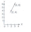
If y-coordinate is 2 times of x-coordinate, them form a table for it and draw a graph.
9.
Draw the graphs for the following tables of values, with suitable scales on the axes.
Distance travelled by a car
| Time (in h) | 6 am | 7 am | 8 am | 9 am |
|---|---|---|---|---|
| Distances(in km) | 40 | 80 | 120 | 160 |
(i) How much distance did the car cover during the period 7:30 am to 8 am?
(ii) What was the time when the car had covered a distance of 100 km, since it starts?
10.
Ashwani can ride a scooter constantly at a speed of 60 km/h. Draw a time-distance graph for this situation. Use it to find,
(a) the time taken by Ashwani to travel 75 km.
(b) the distance covered by Ashwani in \(3\frac { 1 }{ 2 } h\)
11.
Principal and Simple Interest
A bank gives 20% simple interest on deposits by senior citizens. Draw a graph to illustrate the relation between the sum deposited and simple interest earned. Find from your graph,
(a) the annual interest obtainable for an investment of Rs. 450.
(b) the investment one has to make, to get an annual simple interest of Rs.90.
12.
Plot the given points on a graph sheet and check, if the points lie on a straight line. If not, name the shape they form, when joined in the given order (4,2), (3,3), (2,4), (5,4)
13.
The following table shows the monthly tourist arrivals from January to June
| Months | January | February | March | April | May | June |
| Number of Tourists |
250 | 400 | 350 | 500 | 150 | 200 |
Draw a histogram from the above table and give the answer.
(a) What is the total number of tourists in the six months?
(b) What is difference between the highest arrival and the lowest arrival of tourists from January to June?
14.
The following data represent the expenditure on various items(named as A, B, ... ) of a family in a month. Represent the data in the form of a pie chart.
| Items | A | B | C | D | E |
| Amount (in Rs.) | 180 | 210 | 240 | 270 | 180 |
15.
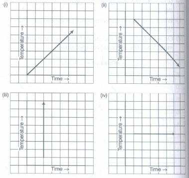
Can there be a time-temperature graph as follows? Justify your answer.
16.
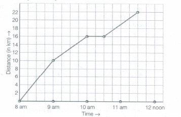
A courier-person cycle from a town to a neighbouring Suburban area to deliver a parcel to a merchant. His distance from the town at different times is shown by the following graph.
(a) What is the scale taken for the time axis?
(b) How much time did the person take for the travel?
(c) How far is the place of the merchant from the town?
(d) Did the person stop on his way? Explain.
(e) During which period did he ride fastest?
17.
Use the tables below to draw linear graphs.
Population (in thousands) of men and women in a village in different years.
| Years | 2003 | 2004 | 2005 | 2006 | 2007 |
| Number of men | 12 | 12.5 | 13 | 13.2 | 13.5 |
| Number of women | 11.3 | 11.9 | 13 | 13.6 | 12.8 |
18.
Use the tables below to draw linear graphs.
The number of days a hill side city received snow in different years.
| Years | 2003 | 2004 | 2005 | 2006 |
| Days | 8 | 10 | 5 | 12 |
19.
The following graph shows the temperature of a patient in a hospital, recorded every hour.
(a) What was the patient's temperature at 1 pm?
(b) When was the patient's temperature 38.5°C?
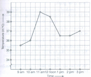
(c) The patient's temperature was the same two times during the period given. What were these two times?
(d) What was the temperature at 1: 30 pm? How did you arrive at your answer?
(e) During which periods did the patient's temperature showed an upward trend?
20.
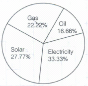
The main source of energy used by each house in a street is given below:
| Source of energy | Solar | Gas | Electricity | Oil |
| Number of houses | 10 | 8 | 12 | 6 |
Represent the above data by means of pie chart.
21.
The following table gives the quantity of petrol and its cost.
| No. of Litres of petrol | 10 | 15 | 20 | 25 |
| Cost of petrol in Rs. | 500 | 750 | 1000 | 1250 |
Plot a graph to show the data.
1.
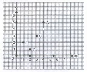
These lie on a line. We can name it as KL or KM or MN etc. It is parallel to x-axis.
These lie on a line. We can name it as XY or WY or YZ etc.
Note that in each of the above cases, graph obtained by joining the plotted points is a line. Such graphs are called linear graphs.
2.
0 to 5 min and 5 to 10 min
3.
The line graph for the area of a square as per the given table.
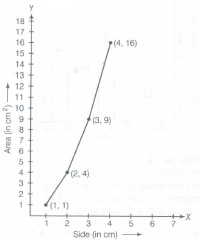
No, it is not a linear graph because when we join the points, then there is not a straight line formed.
4.
The histogram of given data is shown below.
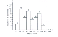
5.
A bar graph for the given temperature in month. from March to July.
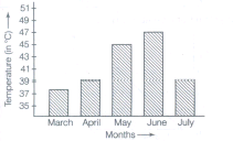
6.
Given points are A(1, 2), 8(3,4) and C(5. 2).
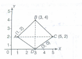
Location of given points on the graph given below So, the diagonals of this rhombus are equal in length. because this is a square, a kind of rhombus, whose diagonals are same.
7.
The histogram of given data is shown below.
8.
Given. y-coordinate = 2 times of x-coordinate.
If x = 2, then y = 2x = 2 x 2 = 4
If x = 3, then y = 2x = 2 x 3 = 6
| x | 2 | 3 |
| y | 4 | 6 |
So, the points are (2, 4) and (3. 6) and graph is shown below:
9.
To draw the graph for the given table of values, we use the following steps:
Step I: Draw X-axis and Y-axis and take scale,on horizontal axis 3 units = 1h, on vertical axis 1 unit = 20 km
Step II : Mark the time (in hours) on horizontal axis and distance (in Ian) on vertical axis.
Step III : Now, plot the points (6, 40), (7, 80), (8, 120) and (9, 160) on graph paper.
Step IV : Join these points.
Then, we get a linear graph which is shown below
s.png)
(i) In the graph, corresponding to 7:30 am on horizontal axis,we get the distance 100 Ian on vertical axis i.e. point P. Distance covered during the period 7:30 am to 8: 00 am = (120 -100) km = 20 km
(ii) In the given graph, ( from point P) at 7: 30 am the car had covered'a distance of 100 km, since it's start.
10.
According to the given information, the table is as follows
| Hours of ride | Distance covered |
|---|---|
| 1h | 60 km |
| 2h | 2\(\times\)60km = 120 km |
| 3h | 3\(\times\)60km = 180 km |
| 4h | 4\(\times\)60km = 240 km and so on |
.png)
We get a table of values.
| Time (in h) | 1 | 2 | 3 | 4 |
|---|---|---|---|---|
| Distance covered(in km) | 60 | 120 | 180 | 240 |
(i) Scale: Horizontal: 2 units = 1 h; Vertical: 1 unit = 10 km
(ii) Mark time on horizontal axis.
(iii) Mark distance on vertical axis.
(iv) Plot the points (1, 60), (2, 120), (3, 180), (4, 240)
(a)\(1\frac { 1 }{ 4 } \) or 1 h 15 min
(b) 210 km
11.
According to the given information, the table is as follows:
| Sum deposited | Simple interest for a year |
|---|---|
| Rs 100 | \(\frac { 100\times 1\times 20 }{ 100 } \) =Rs 20 |
| Rs 200 | \(\frac { 200\times 1\times 20 }{ 100 } \)=Rs 40 |
| Rs 300 | \(\frac { 300\times 1\times 20 }{ 100 } \)=Rs 60 |
| Rs 500 | \(\frac { 500\times 1\times 20 }{ 100 } \)=Rs 100 |
| Rs 1000 | \(\frac { 1000\times 1\times 20 }{ 100 } \)=Rs 200 |
Steps to follow
Step I Find the quantities to be plotted as deposit and SI.
Step II Decide the quantities to be taken on X-axis and on Y-axis.
Step III Choose a scale.
Step IV Plot points.
Step V Join the points.
We get a table of values:
| Deposit (in Rs.) | 100 | 200 | 300 | 500 | 1000 |
|---|---|---|---|---|---|
| Annual SI (in Rs) | 20 | 40 | 60 | 100 | 200 |
(i) Scale: 1 unit = Rs. 100 on horizontal axis, 1 unit = Rs 20 on vertical axis.
(ii) Mark deposits along horizontal axis,
(iii) Mark simple interest along vertical axis,
(iv) Plot the points: (100,20), (200,40), (300,60), (500, 100), etc.
(v) Join the points. We get a graph, i.e a line.
.png)
(a) Corresponding to Rs 450 on horizontal axis, we get the interest to be Rs. 90 on vertical axis.
(b) Corresponding to Rs 90 on the vertical axis, we get the sum to be Rs. 450 on the horizontal axis.
12.
Plotting of points (4, 2) (2,4) (3, 3) (5,4).
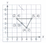
No, the points do not lie on a straight line. These points form a triangle.
13.
.png)
Total number of tourists = 1850
Difference between highest arrival and lowest arrival = 350
14.
.png)
15.
We know that, if time is increasing, then-temperature will either be increase or decrease or constant.
(i) Yes, it is the time-temperature graph, because it shows increase in temperature with increase in time.
(ii) Yes, it is the time-temperature graph, because it shows decrease in temperature with increase in time.
(iii) No, it is not the time-temperature graph, because it shows that at a particular time-temperature increase (i.e. different temperature) which is not possible.
(iv) Yes, it is the time-temperature graph, because it shows that at different time (or increasing time) temperature is constant (or same).
16.
(a) In the given graph, the scale is taken for the time axis (i.e. along X-axis) is 4 units = 1h.
(b) The person starts travel at 8 am and end at 11: 30 am.
So, total travelling time = Difference between 8 am to 11: 30 am = \(3\frac{1}{2}\)h or 3 h 30 min
(c) From the given graph, it is clear that the distance of place of the merchant from the town is 22 km.
(d) Yes, from the given graph, it is clear that the person was 16 km away from town when the time was 10 am to 10: 30 am. This shows that the person did not tray during the interval 10 am to 10: 30 am. The horizons line segment representing travel during this period is illustrative of this fact.
(e) Distance covered by person between 8 am to 9 arn = 10krn
Distance covered by person between 9 am to 10 am = (16 - 10)km = 6 km
Distance covered by person between 10 am to 10: 30 am = (16 -16) km = 0 km
Distance covered by person between 10: 30 am to 11: 30 am = (22 -16) km = 6 km
Hence, we can say that the courier person ride fastestin between 8 am to 9 am.
17.
Firstly, draw two perpendicular lines on the graph paper and then take year along X-axis (horizontal line) and population (in thousand) along Y-axis (vertical line).
Now, mark the points (2003, 12), (2004, 12.5), (2005, 13), (2006, 13.2) and (2007, 13.5) on the graph paper and join them by dark line. Thus, we get linear graph for men. Again, mark the points (2003, 11.3), (2004, 11.9), (2005, 13), (2006, 13.6) and (2007, 12.8) on the graph paper and join them by dotted lines. Thus, we get linear graph for women. Hence, the required linear graph for population (in thousands) of men and women in a village in different years is given below.
b.png)
18.
Firstly, draw two perpendicular lines on the graph paper and then take year along X-axis and days along Y-axis. Now, mark the points (2003, 8), (2004, 10), (2005, 5) and (2006, 12) on the graph paper and join them. Thus, we get a linear graph which shows snowfall in different years.
a.png)
19.
(a) From the given graph, it is clear that the patient's temperature at 1 pm was36.5°C.
(b) From the given graph, it is clear that the patient's temperature was 38.5°C at 12 noon.
(c) From the given graph, it is clear that the patient's temperature was same i.e. 36.5°C at 1 pm and 2 pm.
(d) From the given graph, it is clear that the patient's temperature at 1 pm and 2 pm was same, which is 36.5°C. This shows that temperature did not change during the interval 1 pm to 2 pm. Also, 1: 30 pm is between 1 pm and 2 pm, so the temperature at 1: 30 pm was 36.5°C.
(e) From the given graph, it is clear that the patient's temperature showed an upward trend during the periods 9 am to 10 am, 10 am to 11 am and 2 pm to 3 pm, because temperature is increasing in these intervals.
20.
Percentage of houses using solar energy = \(\frac{10}{36}\times 100=\frac{1000}{36}\) = 27.77%
Percentage of houses using gas energy = \(\frac{8}{36}\times 100\) = 22.22%
Percentage of houses using electricity energy = \(\frac{12}{36}\times 100=\frac{1200}{36}\) = 33.33%
Percentage of houses using oil energy = \(\frac{6}{36}\times\) 100 = 16.66%
Pie graph of the above data is given below:
21.
(i) Let us take a suitable scale on both the axes (Fig)
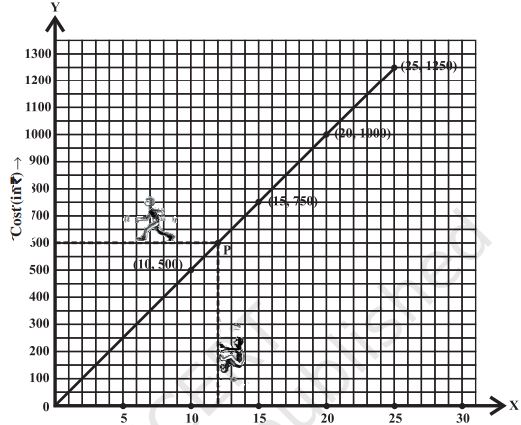
(ii) Mark number of litres along the horizontal axis.
(iii) Mark cost of petrol along the vertical axis.
(iv) Plot the points: (10,500), (15,750), (20,1000), (25,1250).
(v) Join the points.

8th Standard CBSE Syllabus & Materials
8th Standard CBSE
CBSE 8th Science Particulate Nature of Matter - New Model Questions Papers Study Material - QB365 Set A
NEW8th Standard CBSE
CBSE 8th Science Pressure, Winds, Stroms and Cyclones - New Model Questions Papers Study Material - QB365 Set A
NEW8th Standard CBSE
CBSE 8th Mathematics Quadrilaterals - New Model Questions Papers Study Material - QB365 Set A
NEW8th Standard CBSE
CBSE 8th Mathematics A story of Numbers - New Model Questions Papers Study Material - QB365 Set A



NCERT Books

Syllabus

Exam Pattern

Sample Question Papers

Previous year Question Papers

Important Notes

MCQ Practice test

NCERT Exemplers

Case study Questions

Image Based Questions

Passage based Questions

HOT Questions

Value Based Questions

Model Questions Papers
NCERT ( Book Back ) Questions

Assertion and Reason
Important Questions And Answers

CBSE 8th Standard CBSE Subjects
CBSE Standards