 100% FREE ACCESS
8th Standard CBSE Syllabus & Materials
8th Standard CBSE
CBSE 8th Social Science Theme D - Factors of Production - New Model Questions Papers Study Material - QB365 Set A
NEW8th Standard CBSE
CBSE 8th Social Science Theme C - Universal Franchise and India's Electoral System - New Model Questions Papers Study Material - QB365 Set A
NEW8th Standard CBSE
CBSE 8th Social Science Theme B - The Rise of the Marathas - New Model Questions Papers Study Material - QB365 Set A
NEW8th Standard CBSE
CBSE 8th Social Science Theme B - Reshaping India's Political Map - New Model Questions Papers Study Material - QB365 Set A
NEW8th Standard CBSE
CBSE 8th Social Science Theme A - Natural Resources and Their Use - New Model Questions Papers Study Material - QB365 Set A
NEW8th Standard CBSE
CBSE 8th Science Keeping Time with Skies - New Model Questions Papers Study Material - QB365 Set A

Published on: 04/09/2019
Data Handling
Download CBSE Class 8th Standard CBSE Mathematics question papers, sample papers, important questions, and previous year solved papers in PDF format. Get free study materials, NCERT solutions, and exam preparation resources for Class 8th Standard CBSE Mathematics
Questions + Answers key
Take MCQ Mathematics Test
1.
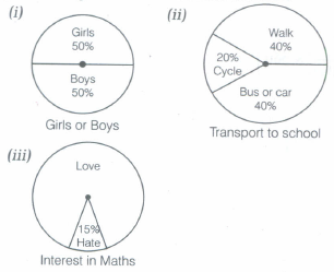
Each of the following pie charts (see the following figures), gives you a different piece of information about your class. Find the fraction of the circle representing each of these information.
2.
Observe the histogram in the following figure and answer the questions given below:
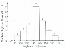
(i) What information is being given by the histogram?
(ii) Which group contains maximum girls?
(iii) How many girls have a height of 145 cm and more?
(iv) If we divide the girls into following three categories, how many would there be in each?
| 150 cm and more | - Group A |
| 140 cm to less than 150 cm | - Group B |
| Less than 140 cm | - Group C |
3.
Construct a frequency distribution table for the data on weights (in kg) of 20 students of a class using intervals 30-35, 35-40 and so on. 40,38,33,48,60,53,31,46,34,36,49,41, 55, 49, 65, 42, 44, 47, 38, 39.
4.
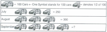
Read the following pictograph and answer the following questions.
(i) How many cars were produced in the month of July?
(ii) In which month were maximum number of cars produced?
5.
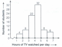
The number of hours for which students of a particular class watched television during holidays is shown through the given graph.
Answer the following:
(i) For how many hours did the maximum number of students watch TV?
(ii) How many students watched TV for less than 4 h?
(iii) How many students spent more than 5 h in watching TV?
6.
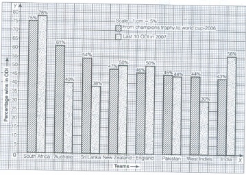
Percentage wins in ODI by 8 top cricket teams.
| Teams | From champions trophy to world cup 2006 |
Last 10 001 in 2007 |
| South Africa | 75% |
78% |
| Australia | 61% | 40% |
| Sri Lanka | 54% | 38% |
| New Zealand | 47% | 50% |
| England | 46% | 50% |
| Pakistan | 45% | 44% |
| West Indies | 44% | 30% |
| India | 43% | 56% |
7.
If you try to start a scooter, what are the possible outcomes?
8.
Which form of graph would be appropriate to display the following data.
| Years | 2001 | 2002 | 2003 | 2004 | 2005 | 2006 |
| Production (in lakh tonne) |
60 | 50 | 70 | 55 | 80 | 85 |
9.
Number of workshops organised by a school in different areas during the last five years are as follows:
| Years | Number of workshops |
| 1995 - 1996 | 25 |
| 1996 - 1997 | 30 |
| 1997 - 1998 | 44 |
| 1998 - 1999 | 52 |
| 1999 - 2000 | 65 |
Draw a histogram representing the above data.
10.
Following numbers related to the weekly wages (in Rs) of 18 workers in a factory :
300, 200, 150, 350, 200, 300, 350, 150, 200, 350, 150, 300, 350, 250, 250, 200, 300, 350
Prepare frequency table.
(i) What is the range in wages (in Rs)?
(ii) How many workers are getting Rs 200?
(iii) How many workers are getting the minimum wages?
11.
Ram puts some buttons on the table. There were 4 blue, 7 red, 3 black and 6 white buttons in all. All of a sudden, a cat jumped on the table and knocked out one button on the floor. What is the probability that the button on the floor is blue?
\(\frac{7}{20}\)
\(\frac{3}{5}\)
\(\frac{1}{5}\)
\(\frac{1}{4}\)
12.
A graph showing two sets of data simultaneously is called a
double bar graph
pie chart
histogram
pictograph
13.
A coin is tossed 300 times and head appeared 180 times. The probability of getting a head in this experiment in
\(\frac{2}{5}\)
\(\frac{1}{5}\)
\(\frac{3}{5}\)
\(\frac{4}{5}\)
14.
The range of the data 18, 20, 22, 19, 17,35,44, 46, 38, 40 is
24
29
46
31
15.
A geometric representation showing the relationship between a whole and its parts is a
pie chart
bar graph
histogram
pictograph
16.
The length of a rectangle in a histogram shows the
width of the class
lower limit of the class
upper limit of the class
frequency of the class
17.
In a throw of die, the probability of getting the number 8, is
\(\frac{1}{2}\)
\(\frac{5}{12}\)
1
0
18.
In a histogram, class intervals and frequencies are taken along _______ axis and ________ axis respectively.
19.
In a throw of a die, the outcomes are equally __________.
20.
Histogram bars are drawn with equal ___________ to a class interval without leaving any gap in between.
21.
The total number of outcomes, when a die is 'thrown, is _____________.
22.
The class size of the interval 28 - 32 is ____________.
23.
The large number of observations are usually organised in groups of equal width called _______.
24.
In a throw of a die, the probability of getting an odd number is the same as that of getting an even number.
25.
The probability of getting a number 6 in a throw of a die is \(\frac{1}{6}\) Similarly, the probability of getting a number 4 is \(\frac{1}{4}\)
26.
One or more outcomes of an experiment make an event.
27.
The central angle of a sector in a pie chart cannot be more than 180o.
28.
The total number of outcomes when a coin is tossed is 6.
29.
In the class intervals 10 - 20, 20 - 30, etc .... respectively, 20 lies in the class interval 10 - 20.
30.
In a pie chart, a whole circle is divided into sectors.
1.
(i) Here, given pie chart shows 100% students of your class, out of which 50% are girls and 50% are boys.
\(\therefore\) Fraction of the circle representing girls = \(\frac{Percentage\ of\ girls}{Percentage\ of\ all\ students}=\frac{50}{100}=\frac{1}{2}\)
[dividing numerator and denominator by 50]
Fraction of the circle representing boys = \(\frac{Percentage\ of\ boys}{Percentage\ of\ all\ students}=\frac{50}{100}=\frac{1}{2}\)
[dividing numerator and denominator by 50]
(ii) Here, given pie chart shows 100% transport to school.
So, Fraction of the circle representing walk = \(\frac{Percentage\ of\ walk}{Total\ Percentage\ of\ transport}=\frac{40}{100}=\frac{2}{5}\)
[dividing numerator and denominator by 20]
Fraction of the circle representing bus or car = \(\frac{Percentage\ of\ cars}{Total\ Percentage\ of\ transport}=\frac{40}{100}=\frac{2}{5}\)
[dividing numerator and denominator by 20]
Fraction of the circle representing cycle = \(\frac{Percentage\ of\ cycle}{Total\ Percentage\ of\ transport}=\frac{20}{100}=\frac{1}{5}\)
[dividing numerator and denominator by 20]
2.
(i) The given histogram represents the heights (in ern) of girls of Class VII.
(ii) Group 140 - 145 contains maximum number of girls i.e. 7.
(iii) Girls having height 145 em and more lie in the intervals 145 - 150,150 - 155 and 155 - 160.
So, number of girls having height of 145 cm and more
= (4 + 2 + 1) = 7
(iv) In group A, girls have height 150 ern and more, so these girls lie in the interval 150 - 155 and 155 - 160. Therefore, number of girls in group A who have height 150 cm and more = 2 + 1= 3
In group B, girls have height 140 cm to less than 150 cm. So, these girls lie in the intervals 140 - 145 and 145 - 150. Therefore, number of girls in group B who have height 140 cm to less than 150 cm = 7 + 4 = 11
In group C, girls have height less than 140 cm. So, these girls lie in the intervals 125 - 130, 130 - 135 and 135 - 140. Therefore, number of girls in group C who have height less than 140 cm = 1+ 2 + 3 = 6.
3.
Here, lowest observation =31
and highest observation = 65
So, we have to take class intervals 30-35, 35-40, 40-45, ... in first column and corresponding frequency i.e. number of students whose weight lie in this class interval, in the second column. Then, frequency distribution table for the above data is given below:
| Class Interval [Weights (in kg)] |
Tally marks | Frequency (Number of students) |
| 30-35 | III | 3 |
| 35-40 | IIII | 4 |
| 40-45 | IIII | 4 |
| 45-50 | .jpg) |
5 |
| 50-55 | I | 1 |
| 55-60 | I | 1 |
| 60-65 | I | 1 |
| 65-70 | I | 1 |
| Total | 20 |
4.
From the above pictograph, we observe that
(i) 250 cars were produced in the month of July.
(ii) The maximum number of cars were produced in the month of September.
5.
(i) Here, maximum height of the bar is 32 for the interval 4 - 5, so the maximum number of students watching TV is 32 and they watch TV for 4 to 5 h.
(ii) It is clear from the given graph that, students watch TV for 1 - 2, 2 - 3, 3 - 4, 4 - 5, 5 - 6 and 6 - 7 h. So, students who watch TV for less than 4 h lie in the intervals 1 - 2, 2 - 3 and 3 - 4. Also, their corresponding frequencies are 4,8 and 22.
\(\therefore\) Number of students watching TV for less than 4 h
= 4 +8 + 22 =34
(iii) Students who watch TV for more than 5 h lie in the intervals 5 - 6 and 6 - 7. Also, their corresponding frequencies are 8 and 6.
\(\therefore\) Number of students watching TV for more than 5 h
= 8 + 6 = 14.
6.
Here, comparison between percentage wins in ODI by 8 top cricket teams is given, so to represent the given information, we draw the double bar graph. So, draw two perpendicular axes OX and OY. Take teams on OX and percentage wins in ODI on OY Choose a suitable scale for OX and OY to draw double'bar graph.
Thus, we get the following double bar graph:
7.
If we try to start a scooter, then it may or may not be start, so possible outcomes are may start or may not start.
8.
To display the production of food grains of a state, bar graph is more appropriate.
9.
.jpg)
10.
Frequency table
| Weekly wages (in Rs) | 150 | 200 | 250 | 300 | 350 |
| Number of workers | 3 | 4 | 2 | 4 | 5 |
(i) Rs 200
(ii) 4
(iii) 3.
11.
(c)
\(\frac{1}{5}\)
12.
(a)
double bar graph
13.
(c)
\(\frac{3}{5}\)
14.
(b)
29
15.
(a)
pie chart
16.
(d)
frequency of the class
17.
(d)
0
18.
Class interval are taken along X-axis and frequencies are taken along Y-axis in a histogram.
19.
In an equally likely outcome, each event has same chance of occurring.
20.
In a histogram, each class interval has equal width and there is no gap in between the bars.
21.
6 outcomes are 1, 2, 3, 4, 5 and 6.
22.
Upper limit - Lower limit = 32 - 28 = 4
23.
For large number of observations, groups of equal width i.e. class interval are organised.
24.
(a)
25.
(b)
26.
(a)
27.
(b)
28.
(b)
29.
(b)
30.
(a)

8th Standard CBSE Syllabus & Materials
8th Standard CBSE
CBSE 8th Science Particulate Nature of Matter - New Model Questions Papers Study Material - QB365 Set A
NEW8th Standard CBSE
CBSE 8th Science Pressure, Winds, Stroms and Cyclones - New Model Questions Papers Study Material - QB365 Set A
NEW8th Standard CBSE
CBSE 8th Mathematics Quadrilaterals - New Model Questions Papers Study Material - QB365 Set A
NEW8th Standard CBSE
CBSE 8th Mathematics A story of Numbers - New Model Questions Papers Study Material - QB365 Set A



CBSE 8th Standard CBSE Subjects
CBSE Standards