 100% FREE ACCESS
11th Standard CBSE Syllabus & Materials
11th Standard CBSE
CBSE 11th Economics PART-A - Presentation of Data - New Sample Question Papers Study Material - QB365 Set A
NEW11th Standard CBSE
CBSE 11th Economics PART-A - Organisation of Data - New Sample Question Papers Study Material - QB365 Set A
NEW11th Standard CBSE
CBSE 11th Economics PART-A - Collection of Data - New Sample Question Papers Study Material - QB365 Set A
NEW11th Standard CBSE
CBSE 11th Economics PART-A - Introduction to Economics and Statistics - New Sample Question Papers Study Material - QB365 Set A
NEW11th Standard CBSE
CBSE 11th Business Studies International Trade Sample Question Papers Study Material - QB365 Set A
NEW11th Standard CBSE
CBSE 11th Business Studies Evolution and Fundamentals of Business Sample Question Papers Study Material - QB365 Set A

Published on: 21/10/2019
Diagrammatic Presentation
Download CBSE Class 11th Standard CBSE undefined question papers, sample papers, important questions, and previous year solved papers in PDF format. Get free study materials, NCERT solutions, and exam preparation resources for Class 11th Standard CBSE undefined
Questions + Answers key
Take MCQ Biology Test
1.
A man visited a newly opened hospital which sowed a pie chart indicating 100% success in heart surgeries. Total operations which hospital has done were two. Do you think pie chart is reflecting the true picture? Which value is missing?
2.
A manager was required to submit the report of components of cost to his senior. Cost had reduced in absolute terms but increased in percentage. He used subdivided bar diagram to present the data. Do you think there was some motive behind it? Which diagram will you recommend to be used?
3.
Differentiate between diagrammatic and tabular presentation of data.
4.
Differentiate between one dimensional and two dimensional diagrams.
5.
Give three examples where deviation bar diagram can be used
6.
Write short note on broken bar diagram.
7.
Diagrams have a memorizing effect. Explain.
8.
Differentiate between sub divided and percentage bar diagram
9.
Differentiate between Sub Divided and Multiple Bar Diagram.
10.
Explain different types of two-dimensional diagrams.
11.
What are the objectives of diagrammatic presentation?
12.
Discuss some of the uses of diagrams.
13.
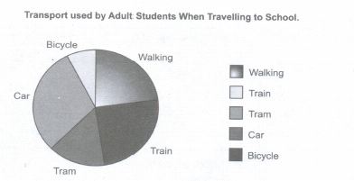
Students in an Adult School were surveyed about the type of transport they use to travel to school.
The results were:
walking 9, train 10, tram 6, car 12, bicycle 3. Construct a pie chart with this information.
14.
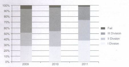
Make a percentage bar diagram from the data given below:
| Year | I Division | II Division | III Division | Fail | Total |
| 2009 | 142 | 118 | 210 | 30 | 500 |
| 2010 | 125 | 120 | 190 | 15 | 450 |
| 2011 | 190 | 180 | 120 | 10 | 500 |
15.
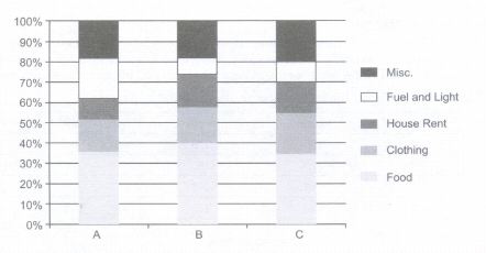
Make a percentage bar diagram from data given below.
| Household | A | B | C |
| Food | 360 | 300 | 210 |
| Clothing | 160 | 135 | 120 |
| House rent | 100 | 120 | 90 |
| Fuel and Light | 200 | 60 | 60 |
| Misc | 180 | 135 | 120 |
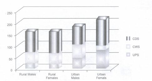
16.
From the data given below, draw a multiple bar diagram.
Unemployment Rates (2004per 1000)
| Rural Males | Rural Females | Urban Males | Urban Females | |
| UPS | 24 | 22 | 46 | 89 |
| CWS | 47 | 45 | 57 | 10 |
| CDS | 90 | 93 | 81 | 117 |
17.
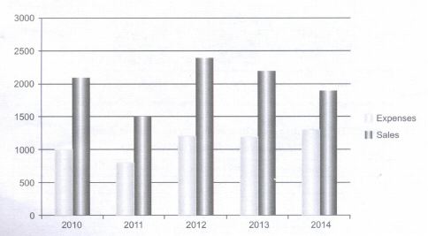
Draw a suitable bar diagram to present following data:
| Year | 2010 | 2011 | 2012 | 2013 | 2014 |
| Expenses | 1000 | 800 | 1200 | 1200 | 1300 |
| Sales | 2100 | 1500 | 2400 | 2200 | 1900 |
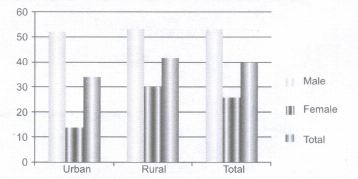
18.
From the data given below, draw a multiple bar diagram.
| Sex | Urban | Rural | Total |
| Male | 51.8 | 53.1 | 52.7 |
| Female | 13.9 | 29.9 | 25.4 |
| Total | 33.7 | 41.7 | 39.5 |
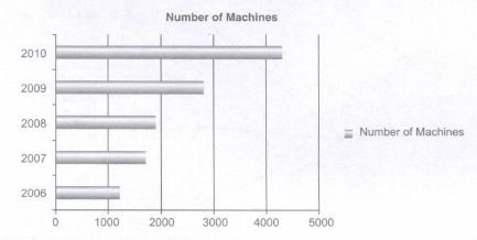
19.
Draw a simple bar diagram
| Year | 2006 | 2007 | 2008 | 2009 | 2010 |
| Number of Machines | 1200 | 1700 | 1900 | 2800 | 4300 |
20.
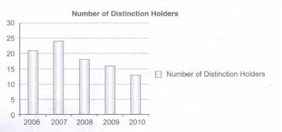
Draw a simple bar diagram.
1.
No, Pie chart is not reflecting the true picture. There was a motive of misrepresentation and manipulation of data. It reflects dishonesty of the hospital managers. In my opinion, they should have used pie chart but mentioning the absolute number as well.
2.
Yes, there was a motive of misrepresentation and manipulation of data. It reflects dishonesty of the manager. In my opinion, he should have used either percentage bar diagram or pie chart as both show relative changes and will show the true picture.
3.
| Diagrammatic Presentation of Data | Tabular Presentation of Data |
| Diagrams and Graphs are meant for a layman. | Tables are meant for statisticians for the purpose of further analysis. |
| Diagrams give only an approximate idea | Tables contain precise figures. Exact values can be read from tables |
| Diagrams can be more easily compared, and can be interpreted by a layman. | Comparison and interpretations of tables can only be done by statisticians and it is a difficult task |
| Diagrams and graphs cannot present much information. | Tables can present more information. |
| Diagrams are more attractive and have a visual appeal. | Tables are dry for a layman (may be attractive to a statistician. ) |
4.
In one-dimensional diagrams or charts, only the length of the bar is taken into consideration. But in two-dimensional diagrams, both its height and width are taken into account for presenting the data. These diagrams, also known as surface diagrams or area diagrams.
5.
Deviation bar charts are suitable for presentation of net quantities in excess or deficit such as profit, loss, import, or exports. The excess (or positive) values and deficit (or negative) values are shown above and below the base line. These are also called Bilateral Bar Diagrams. Three examples where these can be used:
(a) To show profit or loss of a company;
(b) To show balance of trade of a country;
(c) To show balance of inflow and outflow of cash in a company.
6.
Sometimes we have such a series in which all values except one are approximate to each other. One value is exceptionally high. In order to provide proper shape, the larger bar is broken at the top and the value of each bar is written on the top. Its purpose is to:
(a) save time
(b) Save space and
(c) To give a proper shape to the diagram
7.
It has been rightly said that a diagram is worth 100 words. It is easier to forget words but it is difficult to forget a diagram once seen. Diagrams have a memorizing effect on human mind. It gives a bird's eye view of the statistical details.
8.
| Subdivided Bar Diagram | Percentage Bar Diagram |
| In Subdivided bar diagram, components are shown in absolute quantities | In percentage bar diagram, quantities are shown in percentages. |
| In Subdivided bar diagrams, all bars are of different size | In percentage bar diagram, all bars are of equal t height |
| It cannot be used to compare relative importance of different components | It can be used to compare relative importance of different components. |
9.
| Subdivided Bar Diagram | Multiple Bar Diagram |
| In Subdivided bar diagram, different components are shown in single bar with divisions. | In multiple bar diagram, different components are shown in different bars. |
| In Subdivided bar diagrams, 4-5variables can be shown | In multiple bar diagram not more than three items can be shown comfortably. |
| It cannot be used to compare relative importance of different components | It can be used to compare relative importance of different components. |
10.
Different types of two-dimensional diagrams have been explained below: Rectangles: Since area of a rectangle is equal to the product of its length and width, while making such type of diagrams both length and width are considered. Rectangles are suitable for use in cases where two or more quantities are to be compared and each quantity is sub-divided into several components. Squares: To construct a square diagram, first the square-root of the values of various figures to be represented is taken and then these values are divided either by the lowest figure or by some other common figure to obtain proportions of the sides of the squares. The squares constructed on these proportionate lengths must have either the base or the center on a straight line. The scale is attached with the diagram to show the variable value represented by one square unit area of the squares. Circles: Circles are alternatives to squares to represent data graphically. The circles are also drawn such that their areas are in proportion to the figures represented by them. The circles are constructed in such a way that their centers lie on the same horizontal line and the distance between the circles is equal. Since the area of a circle is directly proportional to the square of its radius, the radii of the circles are obtained in proportion to the square root of the figures under representation. Thus, the lengths that were used as the sides of the square can also be used as the radii of circles.
11.
Objectives of diagrams is to:
(a) Save time and energy;
(b) Forecast future events;
(c) Compare different items and components.
(d) Make data simple and comparable
12.
Some uses of the diagrams are as follows:
(a) Attractive and Impressive: Diagrams are attractive and impressive.
(b) Simple and easily understandable:
Diagrams are easy and simple to understand. Knowledge of mathematics is not required to understand diagrams.
(c) Useful in Comparison: Diagrams prove very useful in comparing data from one year to another or otherwise.
(d) Helps in forecasting: It helps us to predict future values on the basis of past statistics.
(e) Save time effort and energy: By simplifying data, diagrams save time, energy and effort.
(f) Diagrams are useful in all fields: From sports to education to medical and engineering, in all fields we make use of diagrams. They are specifically useful for policy formulation and decision making.
13.
Pie chart
| Transport Type | Number of Students | Percentage of Student preferring transport type | Angle size for pie chart |
| Walking | 9 | \(\frac{9}{40}\times100\) =22.50% | 22.5% of 360o = 81o |
| Train | 10 | \(\frac{10}{40}\times100\) =25% | 25 % of 360o = 90o |
| Tram | 6 | \(\frac{6}{40}\times100=15\)% | 15 % of 360o = 54o |
| Car | 12 | \(\frac{12}{4}\times100\) =30% | 30 % of 360o = 108o |
| Bicycle | 3 | \(\frac{3}{40}\times100\) =7.5% | 7.5 % of 360o = 27o |
14.
| Year | I Division(%) | II Division(%) | III Division(%) | Fail(%) | Total |
| 2009 | 28.4 | 23.6 | 42 | 6 | 100 |
| 2010 | 27.77 | 26.66 | 42.22 | 22.55 | 100 |
| 2011 | 38 | 36 | 24 | 2 | 100 |
15.
Percentage of expenditure on different items
| Company | A(%) | B(%) | C(%) |
| Food | 36 | 40 | 35 |
| Clothing | 16 | 18 | 20 |
| House Rent | 10 | 16 | 15 |
| Fuel and Light | 20 | 8 | 60 |
| Misc. | 18 | 18 | 20 |
| Total | 100 | 100 | 00 |
16.
17.
18.
Worker Population Ratio in India 1999-2000
19.
20.
| Year | 2006 | 2007 | 2008 | 2009 | 2010 |
| Number of distinction | 21 | 24 | 18 | 16 | 13 |

11th Standard CBSE Syllabus & Materials
11th Standard CBSE
CBSE 11th Business Studies Forms of Business Organisation Sample Question Papers Study Material - QB365 Set A
NEW11th Standard CBSE
CBSE 11th Business Studies Business, Trade and Commerce Sample Question Papers Study Material - QB365 Set A
NEW11th Standard CBSE
CBSE 11th Physics Waves Sample Question Papers Study Material - QB365 Set A
NEW11th Standard CBSE
CBSE 11th Physics Kinetic Theory Sample Question Papers Study Material - QB365 Set A



CBSE 11th Standard CBSE Subjects
CBSE Standards