 100% FREE ACCESS
11th Standard CBSE Syllabus & Materials
11th Standard CBSE
CBSE 11th Economics PART-A - Presentation of Data - New Sample Question Papers Study Material - QB365 Set A
NEW11th Standard CBSE
CBSE 11th Economics PART-A - Organisation of Data - New Sample Question Papers Study Material - QB365 Set A
NEW11th Standard CBSE
CBSE 11th Economics PART-A - Collection of Data - New Sample Question Papers Study Material - QB365 Set A
NEW11th Standard CBSE
CBSE 11th Economics PART-A - Introduction to Economics and Statistics - New Sample Question Papers Study Material - QB365 Set A
NEW11th Standard CBSE
CBSE 11th Business Studies International Trade Sample Question Papers Study Material - QB365 Set A
NEW11th Standard CBSE
CBSE 11th Business Studies Evolution and Fundamentals of Business Sample Question Papers Study Material - QB365 Set A

Published on: 28/09/2019
Graphic Presentation
Download CBSE Class 11th Standard CBSE undefined question papers, sample papers, important questions, and previous year solved papers in PDF format. Get free study materials, NCERT solutions, and exam preparation resources for Class 11th Standard CBSE undefined
Questions + Answers key
Take MCQ Biology Test
1.
How do we get class intervals when mid points are given?
2.
What are the general rules to construct a Time Series graph?
3.
What are time series graph? What are its other names?
4.
What is shown on X-axis and Y-axis of a graph?
5.
What is procedure of drawing histogram in case of unequal class interval?
6.
Give steps for making frequency polygon.
7.
What is a false base line? How is it different from a kinked line?
8.
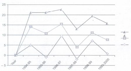
The following table shows the estimated sectoral real growth rates (percentage change over the previous year)in GDP at factor cost.
| Year | Agriculture and allied sectors | Industry | Services |
| 1994-95 | 5.0 | 9.2 | 7.0 |
| 1995-96 | -0.9 | 11.8 | 10.3 |
| 1996-97 | 9.6 | 6.0 | 7.1 |
| 1997-98 | -1.9 | 5.9 | 9.0 |
| 1998-99 | 7.2 | 4.0 | 8.3 |
| 1999-2000 | 0.8 | 6.9 | 8.2 |
9.
A report on sugar mill reported that sugar production during the first fortnight in December 2010 was about 3, 87,000 tones as against 3, 40,000 during the same fortnight last year. The Off-take of sugar from factories during the first fortnight of December, 2001 was 2, 83,000 tonnes for internal consumption and 41,000 for exports as against 1, 54,000 tonnes for internal consumption and 24,000 tonnes for exports last year.
Tabulate the data.
10.
How does the procedure of drawing a histogram is differ when class intervals are unequal in comparison to equal class intervals in a frequency table?
11.
Suppose you want to emphasize the increase in the share of urban nonworkers and lower level of urbanization in India as shown in the example given below. How would you do it in a tabular form?
Distribution of 542 respondents by their age in an election stud in Bihar
| Age group years | No. of Respondents | Per Cent |
| 20-30 | 3 | 0.55 |
| 30-40 | 61 | 11.25 |
| 40-50 | 132 | 24.35 |
| 50-60 | 153 | 28.24 |
| 60-70 | 140 | 25`.83 |
| 70-80 | 51 | 9.41 |
| 80-90 | 2 | 0.37 |
| All | 542 | 100 |
Source: Assembly Election Patna Central Constituency, 2005A. N. Sinha Institute of Social Studies Patna
12.
What kind of diagrams are more effective in representing the following?
(a) Monthly Rainfall in a year
(b) Composition of population of Delhi by Religion
(c) Components of cost in a factory
13.
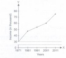
Exhibit the data given blow with the help of a time series graph.
| Per Capita Income of a Country | |
| Year | Income (in thousand) |
| 1971 | 30 |
| 1981 | 48 |
| 1991 | 53 |
| 2001 | 60 |
| 2011 | 75 |
14.
Given below is daily expenditure of 30 families.
| 11 | 20 | 26 |
| 12 | 21 | 27 |
| 14 | 21 | 28 |
| 16 | 22 | 28 |
| 16 | 22 | 31 |
| 17 | 23 | 32 |
| 18 | 23 | 32 |
| 18 | 24 | 33 |
| 20 | 25 | 36 |
| 20 | 25 | 38 |
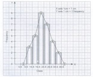
Present these data in a continuous series using the following class intervals. 10-14,15-19,20-24, 25-29, 30-34,35-39. Then draw a frequency polygon from it.
15.
Represent the following data by means of a Histogram
| Daily Wages(Rs) | Number of Workers if) |
| 10-20 | 7 |
| 20-30 | 12 |
| 30-50 | 10 |
| 50-80 | 12 |
| 80-100 | 16 |
1.
Following steps are taken.
(a) Add mid values of two successive classes.
(b) Divide it by 2.
(c) It is upper limit of preceding class and lower limit of successive class.
(d) Find the difference between mid values of two successive classes.
(e) Deduct it from the upper limit obtained to get lower limits of the preceding class.
(f) Repeat it for all classes if classes are unequal (if difference between different mid values is different) and if classes are equal (if difference between different mid values is equal) simply keep on adding the difference between two successive mid values to find the upper limits of different classes.
2.
General rules to construct a Time Series graph
(a) Since time can never be in negative values, II and III quadrant are not used in making of time series graphs.
(b) Time period (week, Month, Year) is taken on X- Axis. And Variable under study is taken on Y-Axis.
(c) We start Yaxis with Zero and decide the scales for both the axis.
(d) Different values are plotted on the graph.
(e) By joining these points, we get a time series graph.
Time series graph can be of three types:
(a) One Variable Graph
(b) Two or more than two variable Graph
(c) When False Base Line is used
(d) Graphs of Different Units
3.
When information is presented over a period of time, it is called time series graph. In it, time (hour, day/date, week, month, year, etc.) is plotted along x-axis and the value of the variable (time series data) along y-axis. A line graph by joining these plotted points, thus, obtained is called arithmetic line graph (time series graph). It helps in understanding the trend, periodicity, etc. in a long term time series data. An example is given below:
4.
Variable is shown on X axis and frequencies are shown on Y axis.
5.
When class intervals are unequal, we follow the steps given below:
(a) Take the class which has the lowest class interval.
(b) Do not adjust the frequencies of the lowest class.
(c) Frequencies of other classes are adjusted according to the lowest class interval.
(d) Formula for adjusting frequency is:
\(\frac { Frequencyofthegivenclass\times Lowestclassinterval }{ ClassIntervalofgivenclass } \)
(e) Keep the width of the rectangle according to class interval of the concerned class and length of the rectangle according to the adjusted frequency.
6.
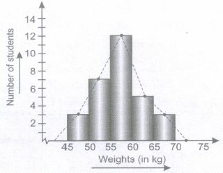
A frequency polygon can also be converted back into a histogram by drawing vertical lines from the bounds of the classes shown on the horizontal axis, and then connecting them with horizontal lines at the hieghts of the polygon at each mid-point. Frequency Polygon can be drawn in two ways:
Method:
(i) Draw a suitable Histogram as explain in the previous section following all the basic principles.
(ii) Get the mid points of the upper horizontal side of each rectangle.
(iii) Join these mid points of the adjacent rectangles of the histogram by straight lines.
(iv) Ends of the frequency polygon are to be extended to mid point of classes at both sides.
(v) Labelling should be properly done and scale of measurement should be clearly shown.
An example is shown below
7.
Usually, when we draw any graph, the scale on which the graph is measured starts from zero on the y-axis. However, under the situations when the data to be plotted on graph starts from a value which is far above zero, results in the problem of shortage of space on graph. To overcome this problem of shortage of space, a false base line is plotted. False base line is a line which is drawn to grasp the attention of the reader on the fluctuations which usually remains unnoticed.
A kinked line is used on x axis for the same purpose for which false base line is used for y axis. It means when variable starts from a higher value, we use kinked line and when frequency starts with a first higher number followed by smaller gaps, we use false base line.
8.
9.
Table showing distribution of production in two fortnights amongst internal consumption, exports and stock. (in tones)
| Sugar Mill | December 2009 (First Fortnight) | December 2010 (First Fortnight) |
| Production Off take from factories | 154,000 | 2,83,000 |
| Exports | 24,000 | 41,000 |
| stock | 1,62,000 | 63,000 |
| Total | 3,40,000 | 3,87,000 |
10.
In case of equal class interval simply we draw the frequencies of equal width but when class intervals are unequal these frequencies need to be adjusted. It will be clear from the example given below:
| Class | Frequency | Adjusted Frequency |
| 0-10 | 3 | 3 |
| 10-30 | 4 | 2 |
| 30-60 | 6 | 2 |
| 60-100 | 4 | 1 |
11.
Depending on the number of variables involved, we determine whether we should use one way, two way, three way or multifold table. To present non workers in urban areas, we will use two way table.
| Age Group in Years | Number of non Workers | ||
| Male | Female | Total | |
| 15-20 | - | - | - |
| 20-25 | - | - | - |
| 25-59 | - | - | - |
| 59 and above | - | - | - |
| Total | - | - | - |
12.
(a) Simple bar Diagram
(b) Pie Chart
(c) Pie Chart
13.
14.
| Class interval | Tally bars | frequency |
| 10-14 | I I I | 3 |
| 15-19 | I I I I | 5 |
| 20-24 | I I I I I I I I | 9 |
| 25-29 | I I I I I I | 7 |
| 30-34 | I I I I | 4 |
| 35-39 | I I | 2 |
| Total | 30 |
Method 1: Now it needs to be converted into exclusive series for constructing a frequency polygon.
| Class interval | Frequency |
| 9.5 -14.5 | 3 |
| 14.5-19.5 | 5 |
| 19.5- 24.5 | 9 |
| 24.5 -29.5 | 7 |
| 29.5 - 34.5 | 4 |
| 34.5 - 39.5 | 2 |
| Total | 30 |
15.
When class intervals are unequal, we follow the steps given below:
(a) Take the class which has the lowest class interval.
(b) Do not adjust the frequencies of the lowest class.
(c) Frequencies of other classes are adjusted according to the lowest class interval.
(d) Formula for adjusting frequency is:
\(\frac { FrequencyofthegivenclassxLowestclassinterval }{ ClassIntervalofgivenclass } \)
(e) Keep the width of the rectangle according to class interval of the concerned class and length of the rectangle according to the adjusted frequency.
Adjusted Frequencies are:
| Daily Wages (Rs) | Number of Workers (f) | Adjusted Frequency |
| 10-20 | 7 | 10 |
| 20-30 | 12 | 12 |
| 30-50 | 10 | \(\frac { 10\times 10 }{ 20 } =5\) |
| 50-80 | 12 | \(\frac { 12\times 10 }{ 30 } =5\) |
| 80-100 | 16 | \(\frac { 16\times 10 }{ 20 } =8\) |
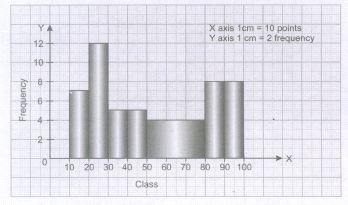
When Frequencies are given by Inclusive Method
It is to be noted that a histogram can be prepared only from exclusive series as there is no gap between rectangles in a histogram. Therefore, if data are given in the form of exclusive series, then it needs ot be converted into exclusive series.

11th Standard CBSE Syllabus & Materials
11th Standard CBSE
CBSE 11th Business Studies Forms of Business Organisation Sample Question Papers Study Material - QB365 Set A
NEW11th Standard CBSE
CBSE 11th Business Studies Business, Trade and Commerce Sample Question Papers Study Material - QB365 Set A
NEW11th Standard CBSE
CBSE 11th Physics Waves Sample Question Papers Study Material - QB365 Set A
NEW11th Standard CBSE
CBSE 11th Physics Kinetic Theory Sample Question Papers Study Material - QB365 Set A



CBSE 11th Standard CBSE Subjects
CBSE Standards